Blog9:Website feedback
This week, Mr. Andy visited our personal website and gave comments from First Impressions/Findability, NAV/Professionalism/UX sections.
The design of my website is relatively general. Although the content is neat and simple, it does not look professional enough.
As far as professionalism is concerned, the width of the text and images of my website seems too narrow, which will cause the pictures not to be loaded or even lost. When Andy opened the map of my project1, the pictures were lost, so I decided to widen my page. Typesetting width.
In addition, the font of my article is not uniform, which leads to the indistinguishability of subtitles, headlines and citations. This problem must be resolved. The teacher’s advice was: “You can follow the layout of your blog2”, and I also corrected it later.
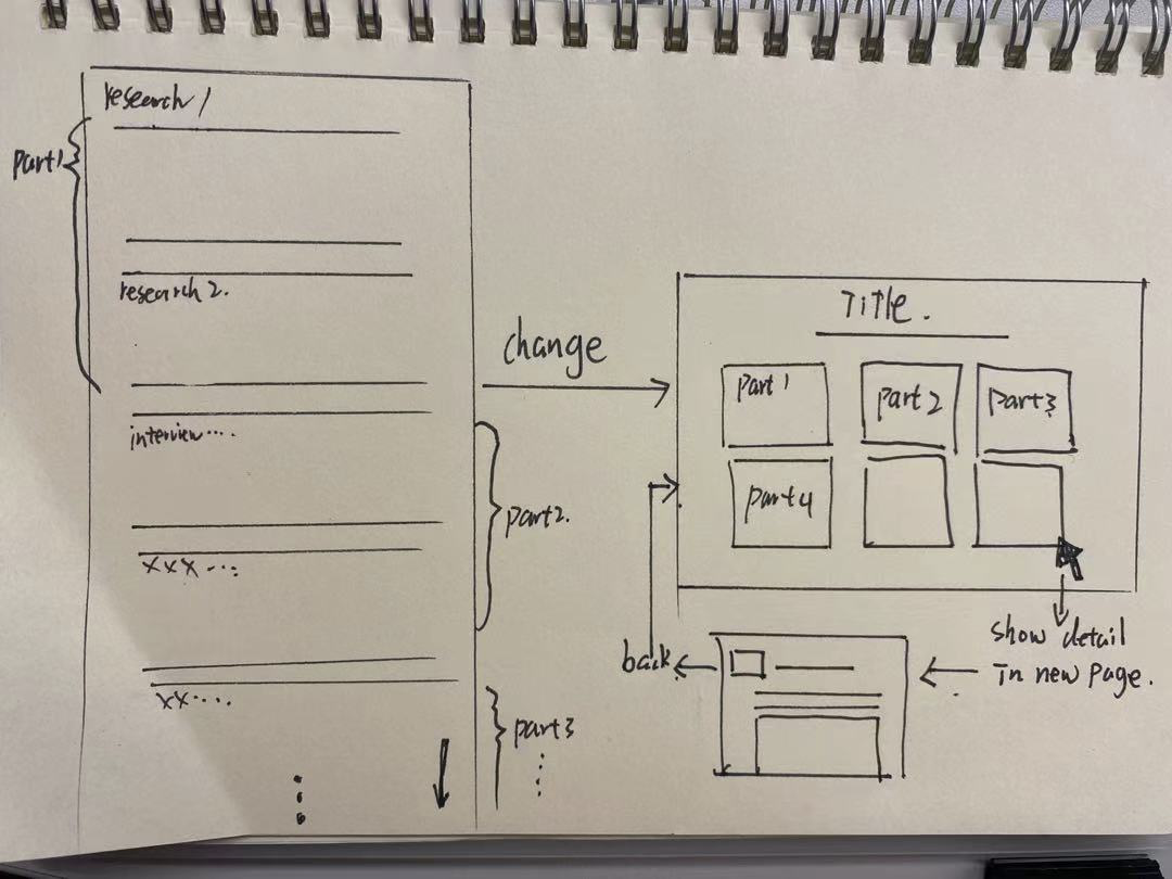
In terms of the UX experience, the content of my page seems very messy. Although the content is very rich, if the content is complicated and put them together, the audience will not find the point, and it looks messy and it is easy to perceive my work. There is no organization. The teacher’s advice is that if there is too much content, you can add several picture link windows. When the user clicks on the picture or title, you can skip directly to the next page. I think the research content of my project3 and project4 is too much. I

I plan to design a few picture pop-ups and put different parts into them, so that it won’t be messy.
In terms of visual impression, my background image needs to be changed. The original background image is a starfish. I originally thought it was cute but the whole is not advanced and unprofessional, so I plan to use a mature image as the background.